Eric Opoku Design Portfolio

Digital Experience UX Evaluation
This project evaluated the Lululemon mobile app to identify usability gaps and improve onboarding, personalization, and content clarity, aligning the experience with its premium brand and membership ecosystem.
The product serves Lululemon customers and members seeking personalized shopping and lifestyle experiences. This was a team sprint in which I contributed to research, ideation, wireframing, and prototyping.
Role: UX Researcher & Strategic Consultant
Timeline: 4-day Sprint


Heuristic Evaluation
A heuristic evaluation of the Lululemon app revealed issues with system status visibility, recognition, and visual hierarchy. Low-contrast indicators, unclear navigation states, and weak contextual cues reduced clarity.
Unclear membership messaging, low CTA readability, and full-screen banners also slowed product discovery. These gaps limited engagement, obscured value, and impacted conversion.


Competitors' Analysis
We conducted a competitive analysis comparing the Lululemon app with leading athletic brands such as Adidas, Puma, and Under Armour to evaluate navigation, features, membership benefits, and shopping experiences.
Key insights revealed gaps in content clarity, product discoverability, and communication of membership value, highlighting opportunities to improve personalization, streamline navigation, and enhance user guidance.


UNDER ARMOUR: Provides a functional and brand-connected experience, including clear navigation cues and integration across sister platforms. The interface supports usability through recognizable structure and cross-platform accessibility.
ADIDAS: Balances product discovery with membership benefits, offering structured rewards systems and clear value exchange. The experience integrates lifestyle positioning with commerce, reinforcing brand identity through its ecosystem.


PUMA: Delivers a highly tailored onboarding experience that drives engagement, with strong emphasis on product discovery through highlights, story-style features, and curated shopping flows. However, it places less focus on membership value and gated features.
Chosen Theme: Limited guidance on content, products, and membership benefits makes the Lululemon app feel transactional and less personalized than Puma and Adidas. Unclear onboarding and weak contextual guidance highlight an opportunity to improve personalization and engagement.


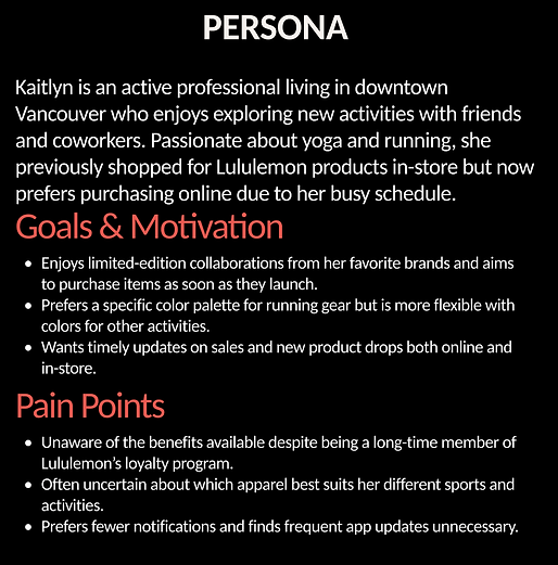
USER PERSONA
This persona represents an active, digitally engaged Lululemon customer who values convenience, timely product updates, and personalized recommendations. Her behaviors, goals, and frustrations highlight the need for clearer membership visibility, guided product discovery, and a more tailored app experience that aligns with her lifestyle and preferences.


DESIGN PROCESS
How we moved from insights to ideas
We synthesized research insights into personas to represent user needs and behaviors. We then mapped user flows to define key journeys and identify friction points. Based on these insights, we created low-fidelity sketches to explore layout, hierarchy, and interaction patterns, enabling rapid ideation before moving into digital design.

Wireframes, iterations, testing, and changes
After synthesizing research insights into personas to represent user needs and behaviors, we mapped user flows to define key journeys and identify friction points. Based on these insights, we created low-fidelity sketches to explore layout, hierarchy, and interaction patterns, enabling rapid ideation before moving into digital design.

Solution I
The final prototype introduces a streamlined onboarding flow that captures user preferences and enables personalized experiences from the outset.
Users define their identity in “Who You Are,” then enable notifications and location services to support tailored recommendations and context-aware content. This ensures relevant products, activities, and experiences are delivered immediately based on user intent.


Tap below to explore the onboarding experience
Solution II
The final prototype enhances product discovery through a personalized and engaging experience.
The “Every Day is Different” screen captures user input, such as energy levels, to generate tailored activity and product recommendations. The Personalized Membership Perks screen presents curated items and exclusive content based on user behavior. The “Same Look, New Items” screen introduces new product drops within a familiar interface, improving discoverability while maintaining consistency.


Tap below to explore the membership experience
Outcome
The redesign improves personalization and product discovery by aligning recommendations with user preferences and real-time inputs. This reduces friction and enables faster decision-making, leading to increased engagement, retention, and product interactions.

Why We Implemented the AARRR Method
We implemented the AARRR framework to structure the redesign across the full user journey, ensuring each stage was optimized for growth, engagement, and retention. It provided a clear, data-driven approach to identifying pain points, prioritizing improvements, and aligning design decisions with measurable outcomes.

Key Learnings:
What we learned
-
Personalization significantly improves engagement and user satisfaction
-
Clear content hierarchy reduces friction and improves navigation
-
Guided onboarding helps capture user intent early
-
Consistency in UI maintains familiarity while introducing new features
What we would do differently next time
-
Introduce deeper customization features earlier (e.g., pinned content, shortcuts)
-
Implement prioritization controls for user feeds
-
Integrate accessibility features (audio, alt text) from the start
-
Validate ideas earlier with more user testing